Thursday, January 31, 2008


Wednesday, January 30, 2008


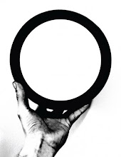
Tuesday, January 29, 2008
Eerily effective, humorous

it breaks every damn rule out there...and yet it still grabbed my attention and made me laugh


A success!

So, the above was my test for posting sketches, photos of inspiration, and otherwise directly from my phone.
For me, I find that I have very little time once I get home to scan sketches and download photos directly from my digital camera - so I will be posting rough sketches directly from my camera phone - which should greatly increase some inspiration. A true notebook I can take anywhere...since I already take my phone everywhere!
You guys can do this too - go to http://go.blogger.com and follow the directions.
Thursday, January 24, 2008


Friday, January 18, 2008
Thursday, January 17, 2008
Java Lords (Very) Initial Sketches
Of course, I stared in the cheesiest way possible when embarking on these sketches. I even asked myself as one point, "How would Shakespeare draw a Java Lord?" You know, like...lords and ladies.


More to come shortly.


More to come shortly.
Tuesday, January 15, 2008
3. A Capella Books
A Capella Books is a book store off Moreland Ave in Atlanta's Inman Park neighborhood. While brand is consistent, it expresses very little about the musical nature of the name as well as the creative nature of the niche books found throughout this local store. Currently, they employ a simple san serif casual script-based font that says very little about their existing customer base and location.
They also employ a gradient which lends itself to be hard to reproduce for promotional material, business cards, and other portable branding materials.

Outdoor signage above entrance of business.
 Enterance with interior sign visible. Outdoor bargain books on shelves outside.
 Interior space. Store is exceptionally long, while very narrow. Books seem to be overflowing from the shelves. However, they are extending into the space to the left of them and are currently renovating.
 Display area for rare and expensive books in back of store. Specializes in rare niche books that can't be found everywhere.
 Cash wrap area, flowing with books on every surface.
Key words describing this establishment:
- Bright
- Casual
- Silent
- Local Books
- Inexpensive
- Niche market
- Just Books (old school book store)
- Bare necessities
- Clean
- Growing
2. Java Lords
Java Lords is a local coffee house off Euclid Ave in Atlanta's Inman Park neighborhood. They host local bands for one show nights as well as open mic nights every Tuesday evening. They sell coffee, baked goods, and have a full bar. They are connected to 7 Stages Theater and share performing space with the lobby of 7 Stages.
When project was being described to manager and staff, they openly said, "We don't really have a brand to redo...we don't even have a logo."
In their own admission of lack of a solid logo, they expressed that they are ripe for a solid brand.

Photo of facade of shop and outdoor signage.

Customer seating area. There is an additional outdoor patio area to the right of this photo.
 Cash wrap and employee area. Bar starts in the foreground and extends back to customer seating area.
Key words describing this establishment:
- Locally owned
- Performance based
- Casual
- Anti-corporate
- Varying customer base
- Local artist based
- Local music based
- Laid back
- Grunge modern
1. Sevananda
Locally owned co-op market in the outer lying flank of Little Five Points in Atlanta's Candler Park neighborhood.
This market sells natural foods, dietary supplements, and local goods.

Current logo and branding. Serif font, tight kerning on the ends, loose throughout with inconsistent typeface throughout branding.

Outdoor branding. Inconsistent with interior branding. Different typeface, different layout. It's apparently that there is even an inconsistency between signage on roof and signage above door. Looks as though all three brands may have been designed by three different people. Co-op design for a co-op market.
 Interior photo of store.
 Interior photo of store.

Customer check out.
This market sells natural foods, dietary supplements, and local goods.

Current logo and branding. Serif font, tight kerning on the ends, loose throughout with inconsistent typeface throughout branding.

Outdoor branding. Inconsistent with interior branding. Different typeface, different layout. It's apparently that there is even an inconsistency between signage on roof and signage above door. Looks as though all three brands may have been designed by three different people. Co-op design for a co-op market.
 Interior photo of store.
 Interior photo of store.
Customer check out.
Key words describing this establishment:
- Local
- Health-centered
- Organic
- Community driven
- Green
- Anti-corporate
Thursday, January 10, 2008


Subscribe to:
Posts (Atom)