Tuesday, April 29, 2008
and I now declare you, discontinued!
http://cirtome.com/b/
already imported all of the entries from this blog, since I liked 'em so much!
Sunday, April 27, 2008
twittering around
if you're not familiar, twitter is an awesome little update service that's basically just the status updates of facebook - it was a nice little replacement for my lack of facebooking...although, I have to tell you, I've gotten more done in the last month without fbook than in a long time.
feeling like a surrealist kind of day...inspiration
Saturday, April 26, 2008
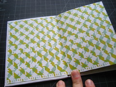
book arts type-based conceptual book
see if you can figure out what the book says...:)
hint: it's lyrics to a song
Designers needing to print!
I'm located about two miles east of campus just down Dekalb Ave in Cabbagetown.
Pricing for Print Only (you provide paper):
8.5" x 11" - $1.00
11" x 17" - $2.25
13" x 19" - $3.75
Pricing for Paper:
Inkpress Luster 11" x 17" Single Sided - $1.25
Inkpress Luster 13" x 19" Single Sided - $2.25
Inkpress Luster 13" x 19" Duo Sided - $4.25
Not necessarily cheap...but the convenience charge...and I'll let you print a test 11" x 17" (on copy paper, economy resolution) for each document for free.
Give me a call 678-933-1798. My doors are open for business until 12 am (midnight) Wednesday morning.
Friday, April 25, 2008
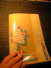
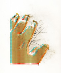
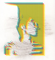
book arts visual book crit
The front cover is printable acetate (with a mylar-type weight). The main visuals are on a printable vellum against patterned, speckled paper.
getting there

more personal projects
Thursday, April 24, 2008
new personal portfolio test concept
the test link - nothing works yet, just static images - http://sqroo.com/jkh

Monday, April 21, 2008
Tuesday, April 15, 2008
Flickkkkkr
Anywho - here I am - creative things on here.
True Peace is...

Monday, April 14, 2008
C-mon Guys, "It's Just Design"
I didn't know this student, didn't know his story, or anything else relating to him - or why he would do such a thing - but it really, as detached as I was from the situation, still sent a shock wave through my ideas of the morning, and the week. We worry about portfolio review, we worry about work-ups, and ideas, and thoughts and evidence of process, and kitsche and wit and all of these things relating to design - how to communicate - and somewhere, weeks, months, years back - we forgot to communicate or failed to communicate effectively with this one life and person.
Not to say that this is the blame of anyone, at all, period - sometimes no amount or form of commucation is effective with anyone - but it just reiterates the idea of what our business is...and the antithesis of something in this system breaking down to bring this person to do this...
I didn't know him, never met him (as far as I can recall), but I am very, truly sad for him and his family - and I'm sorry I (not in a sense of regret or remorse) couldn't have the opportunity to have met and experienced another creative person.
I will admit - I hate railing onto something that I have no personal attachment to, namely because I never feel like I really have the right or place to do so, but I just...I dunno - always have something to say. Just my nature...and this does hit closer to home, especially as a peer.
Sunday, April 6, 2008
Hand Draw Thy Type, then Scan Thy Type In, Then Live Trace Thy Type, Then Apply A Stroke to Thy Type... - Thou Art Almost There!
Thin Thy Chunkiness, and Remove Thy Superfluous Dots, again.


And remove thy word mark, and change thy color! Alas!
EDIT: Why is this so hard? To make a logo for yourself - it's more difficult that making a logo for anyone else. I'm not confused - there are just about 100,000,000 different directions I could go with this. I need to sit back down and make some lists and do some brain storms. Designing a logo is expressing exactly who you are, in a mark - I mean, duh..., but when it's personal, it's different. Hah - I'm not sure why?
Must...do...more...sketches.
EDIT 2: Bear with me, I think I may have a better direction.
New logo
Spiderella
It's worth the 10 minute watch.
Friday, April 4, 2008
Book Boards!


Tuesday, April 1, 2008
Ford's New, Weaker, Logo

I'm not a fan, but, you know, who am I?
The original article on Brand New
This was an April fools post on Brand New. Bah.
Friday, March 28, 2008
So Why Don't We Cut it In Half? (Salvaged blog post from a year ago)
Paul Rodecker has just made me reexamine my life, and he doesn’t even realize it.
My friend Kate and I were having a discussion on relationships and the exacting nature of planning out your life. Her issue stemmed from planning out her future before even making in to the level of having to be that serious and determined about her standing in her relationships. We started talking about how it had become stagnant and predictable and monotonous. Their relationship was enduring, but was is genuinely a relationship worth having?
And then it hit me.
I’ve recently finished a drawing two class with Paul Rodecker, probably one of the most enthusiastic professors at Georgia State that I’ve yet to have (and probably one of the most fulfilling classroom experiences I’ve had) and he consistently was chalk full of cheesy goodness and wit. But among the thorns of corn, there was so much more profound wisdom.
Some of the greatest things I learned from his class was the importance of pushing back something that didn’t work, spending time on something even if you start to hate it, and then, when you do hate it, cut it in half and push it back again until you make something beautiful.
I was thinking about this wisdom as we were talking, and it wasn’t as though this consciously made sense to me at the time we were talking so much as it all fell into place - but a drawing is a multistep experience - so much like the things we encounter in life.
Hardly anything is cut and dry.
You start with furious strokes, the gesture. One hand moving swiftly across a page, sketching out the full experience of the visual representations in front of you. The gesture catches the life and essence. It’s fast and furious and emotional and - well, fantastic.
Then you move to detail. Detail adds significance to a drawing. You can spend hours upon hours upon days upon weeks upon months on detail. Detail can make or break a drawing. The drawing is often in the many intricate details that you stop and see and look deeply into. To appreciate a drawing that took hours upon hours you have to stop and look, and stare, and get close and examine the detail. Detail takes thought and planning.
Then, there’s protection. You’ve spent so much time on a drawing and accumulated so much detail that you can’t help but protect your investment.
But there’s still so much more to add, and you don’t even realize that.
Paul explained all of this - and it never became so clear until I tried to apply that to a relationship.
You start a relationship with emotion. Raw emotion - and excitement. Each step you take is a pen stroke - swift, straight down the page - catching every plausible, conceivable emotion at that moment in that moment. You can’t get enough of the other person and do whatever you can to get as much of that person around you as possible - like a gesture - to get as much information on the page in a short amount of time.
Then you move to romance, and forethought. You’ve attracted the other person and caught them up. And they’ve caught you. The details of the relationship fall into place. What is this person’s view on such-and-such issue? How do they like their eggs? Where is it that they like to be nibbled on the ear? How do our emotions intersect? How can we make this work? How can we make this work even better? How do I tell this person that I love them? These questions beckon like the thousands of concentric circles on a days long sketch. Or the shading of a face that looks so photorealistic, you can’t believe it’s really a drawing - but appreciate it even more when you know it is. The details make the relationship work - they make it worthwhile and prove that there is so much good in the interactions of just two people.
Then you move to complacency. The daily grind sets in. Relationships move slower, there isn’t as much interest in know the other person so much as retaining the information you already know and hoping so much that they don’t change from the person you learned about - the person that you grew to like. You put all of your effort into making a vested interest in protecting your relationship rather than doing your best to make it better and innovate. Like a drawing, you spray fixative all over it, thinking that you’re done - when really, you can’t see the potential that’s lying just around the corner. You grow bored, but want things to stay the same, not realizing the intense damage that you’re doing. Not realizing that things never are the same - they are constantly and forever moving.
So cut it in half.
When we would become too attached to a drawing, Paul would tell us to cut it in half.
And we all looked at him like he was crazy. And then we would do it just to see if he was right.
And we discovered something so profoundly enriching when we would do this, that it became our habit to cut drawings in half, add paper - et al.
We need to cut our relationships in half - we need to cut our lives in half sometimes. The metaphor can be entirely applied to life as a whole (which I later realized as we were talking even further). Life is in the gestures, and the details, and sometimes in the protection.
But sometimes you have to push life back, and cut it in half for the true meaning to come out.
Thursday, March 27, 2008
Wednesday, March 26, 2008
Friday, March 21, 2008
better bottom text contrast
Wednesday, March 12, 2008
Print Ad, Rough Work-up, v. 3, no explanation

So, keeping with the whimsical aesthetic I'm trying to create, I decided to go with something more humorous to start. I wanted to play off a classic that everyone would understand, but I also wanted to make it a game of reader intellect (to be fair, I've never read Moby-Dick, but I know the base story, character's names, etc - however, the ad is kind of the "behind the scenes"). I want to do a series involving a Tale of Two Cities, and Jane Eyre, or some other classic. A Capella has a lot of unknowns, but I don't want the message to be lost in obscurity. Even if people have little interest in the classics, hopefully the tinge of humor will make them rethink "book store" and at least get them in the door so they can discover other titles.
Well, that's the idea at least. A new spin on old stories will hopefully at least get them in the door.
The above iteration is rull, rull rough. Rull rough. But, there's a concept.
