this blog, alas, is now discontinued since the semester is at its close. however, I have revived my cirtome.com domain, and will be posting over here:
http://cirtome.com/b/
already imported all of the entries from this blog, since I liked 'em so much!
Tuesday, April 29, 2008
Sunday, April 27, 2008
twittering around
if anyone cares to keep up over the summer - I'm on twitter - http://www.twitter.com/prodmod
if you're not familiar, twitter is an awesome little update service that's basically just the status updates of facebook - it was a nice little replacement for my lack of facebooking...although, I have to tell you, I've gotten more done in the last month without fbook than in a long time.
if you're not familiar, twitter is an awesome little update service that's basically just the status updates of facebook - it was a nice little replacement for my lack of facebooking...although, I have to tell you, I've gotten more done in the last month without fbook than in a long time.
feeling like a surrealist kind of day...inspiration
some good, creepy, delightful inspiration for some cool work today, compliments of Xiu Xiu and Blonde Redhead -
Saturday, April 26, 2008
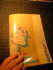
book arts type-based conceptual book
this is my conceptual type-based book for book arts. the text block is a simple pamphlet style, stitch bound, with a hard cover.
see if you can figure out what the book says...:)
hint: it's lyrics to a song
see if you can figure out what the book says...:)
hint: it's lyrics to a song
Designers needing to print!
I am opening up my Epson R1800 for portfolio printing (not whole portfolios - we're talking last minute prints here) if anyone needs to take advantage. I'm stocked on Inkpress Luster Finish (single and duo sided).
I'm located about two miles east of campus just down Dekalb Ave in Cabbagetown.
Pricing for Print Only (you provide paper):
8.5" x 11" - $1.00
11" x 17" - $2.25
13" x 19" - $3.75
Pricing for Paper:
Inkpress Luster 11" x 17" Single Sided - $1.25
Inkpress Luster 13" x 19" Single Sided - $2.25
Inkpress Luster 13" x 19" Duo Sided - $4.25
Not necessarily cheap...but the convenience charge...and I'll let you print a test 11" x 17" (on copy paper, economy resolution) for each document for free.
Give me a call 678-933-1798. My doors are open for business until 12 am (midnight) Wednesday morning.
Friday, April 25, 2008
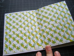
book arts visual book crit
Go to my flickr page for a set of photos for the conceptual visual book I just finished working on for book arts today. I'm really pleased with the visuals on the inside. I just used a simple signature style book, saddle stitched.
The front cover is printable acetate (with a mylar-type weight). The main visuals are on a printable vellum against patterned, speckled paper.
The front cover is printable acetate (with a mylar-type weight). The main visuals are on a printable vellum against patterned, speckled paper.
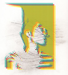
getting there
one aspect of design that really fascinates me is currency design. if you look at a one dollar bill, like, intently stare at it, you see all of these little teeny tiny etchings that took someone hours and hours to meticulously put in by hand. it's really beautiful. I want t capture some of that tiny aspect, with a little real feel along side, with a clean legibility on the important type. this is a concept for a book cover/web splash/et al.


more personal projects

utilizing the kind of destructive nature, this time juxtaposed with some cleanliness. I like this more than my website concept.
and no rubine red c!
Thursday, April 24, 2008
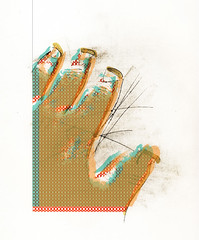
new personal portfolio test concept
I swear...I will stop using Pantone Rubine Red C. I just love the hell out of it, though. It's wonderful. Here's the general mood for my next revision of my portfolio site.
the test link - nothing works yet, just static images - http://sqroo.com/jkh

the test link - nothing works yet, just static images - http://sqroo.com/jkh

Monday, April 21, 2008

Tuesday, April 15, 2008

Flickkkkkr
I immediately needed something new to catalogue my photos on, after my demise on Facebook.com...and I chose Flickr (instead of Picasa).
Anywho - here I am - creative things on here.
Anywho - here I am - creative things on here.
True Peace is...
...killing the world's most notorious time wasting website, one deleted status update and profile photo at a time. I've had my facebook profile for over two years, and well, no longer. Deactivated, and requested official deletion. I encourage others to do the same if they think they could - time to reconnect IRL (in real life!).


Monday, April 14, 2008
C-mon Guys, "It's Just Design"
So, I had a sober awakening this morning as I stumbled, weary and tired into my graphic design history class. We were greeted with news that a junior level student in the program had died, specifically, as they told us (which is why I'm writing and assuming it is common knowledge) committed suicide.
I didn't know this student, didn't know his story, or anything else relating to him - or why he would do such a thing - but it really, as detached as I was from the situation, still sent a shock wave through my ideas of the morning, and the week. We worry about portfolio review, we worry about work-ups, and ideas, and thoughts and evidence of process, and kitsche and wit and all of these things relating to design - how to communicate - and somewhere, weeks, months, years back - we forgot to communicate or failed to communicate effectively with this one life and person.
Not to say that this is the blame of anyone, at all, period - sometimes no amount or form of commucation is effective with anyone - but it just reiterates the idea of what our business is...and the antithesis of something in this system breaking down to bring this person to do this...
I didn't know him, never met him (as far as I can recall), but I am very, truly sad for him and his family - and I'm sorry I (not in a sense of regret or remorse) couldn't have the opportunity to have met and experienced another creative person.
I will admit - I hate railing onto something that I have no personal attachment to, namely because I never feel like I really have the right or place to do so, but I just...I dunno - always have something to say. Just my nature...and this does hit closer to home, especially as a peer.
Sunday, April 6, 2008


Hand Draw Thy Type, then Scan Thy Type In, Then Live Trace Thy Type, Then Apply A Stroke to Thy Type... - Thou Art Almost There!


For those of you just joining us...please direct yourself to the archives on the right hand side...as they have more posts listed than are visible on the main page.
Also...I don't want to "rip myself off" but...I think this style really says a lot about me.
Thoughts?
Thin Thy Chunkiness, and Remove Thy Superfluous Dots, again.


And remove thy word mark, and change thy color! Alas!
EDIT: Why is this so hard? To make a logo for yourself - it's more difficult that making a logo for anyone else. I'm not confused - there are just about 100,000,000 different directions I could go with this. I need to sit back down and make some lists and do some brain storms. Designing a logo is expressing exactly who you are, in a mark - I mean, duh..., but when it's personal, it's different. Hah - I'm not sure why?
Must...do...more...sketches.
EDIT 2: Bear with me, I think I may have a better direction.
Subscribe to:
Posts (Atom)